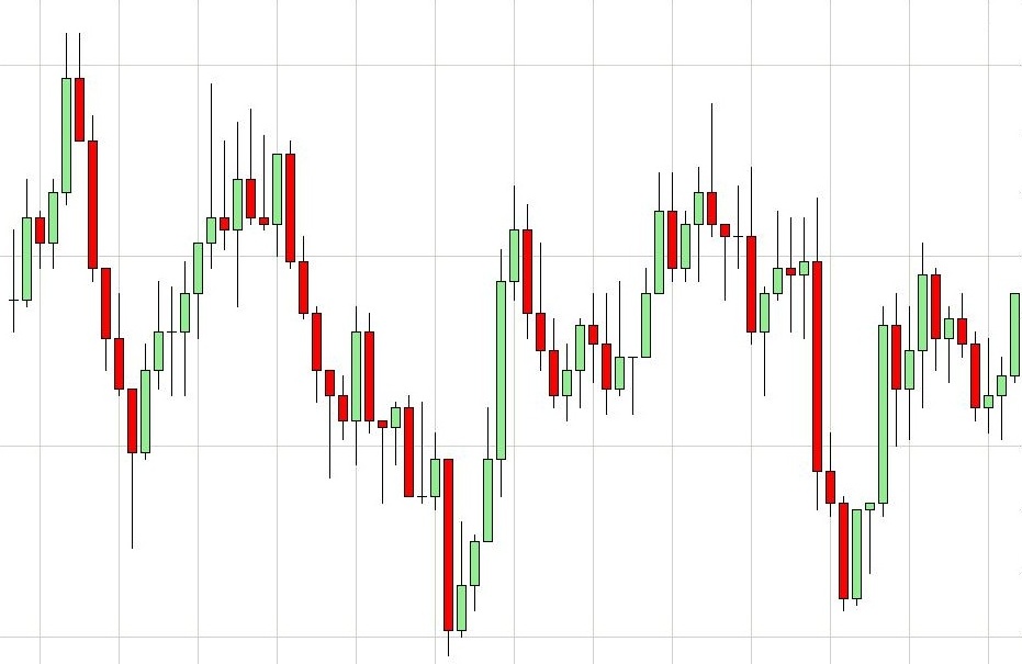
Photo by CC user Ahardy66 via Wikipedia English
Binary option trading relies on the traders’ ability to analyze asset behavior based on market characteristics. One of the ways that traders do this is by looking at asset trends over a period of time; while past behavior isn’t an absolute method for predicting if an asset will expire in or out of the money, it does help calculate the risk vs. reward ratio that many traders rely on for their strategy.
If you’ve ever done a technical analysis of an asset, you’ve probably seen a candlestick chart. These are helpful graphs that assess the way the price of an asset evolves over time. They are called candlestick charts because they are made up of slim rectangles, like candlesticks, that are either red or green. They also have two wicks, one on each end. Let’s look at what each of these characteristics mean, and develop a deeper understanding of how candlestick charts work.
Color
The color of the candlestick informs the trader if they are looking at a bullish or bearish moment in the asset’s history. (Bullish, for those unfamiliar with the term, means that investors believed that the stock price would be increasing. Bearish means that the stock price was believed to be declining at that moment.) A green candlestick is bullish, while a bearish candlestick is red.
Length
The length of each candlestick also gives us a clue about the asset’s opening and closing prices. For a bullish candlestick, the opening price is the low end of the stick, while the closing price is the upper end. It’s the opposite for a bearish candlestick. So, a short candlestick didn’t fluctuate much. This indicates a stagnant asset or market, which can be hard to predict accurately. A long candlestick means that there was a major change, and it’s that information that traders use to analyze risk vs. potential reward.
Wick
The wick (tiny lines extending from each end of the candlestick) shows how volatile for the price was when the trade opened and closed. The wick at the top shows how volatile the market was when the trade opened; the wick at the bottom shows the information for when the trade closed. The longer the wick, the more volatile the asset or market.
Trends, Hammers, and Hanging Mans
So, keeping all those characteristics in mind, evaluating trends becomes much easier. For example, if an asset shows a clear tendency towards long, green candlesticks with short wicks, this means that the asset tends to expire in the money, with major changes between the opening and closing price, and without much volatility in the market.
There are certain patterns that are so common that they have their own names. A hammer, for example, is a long, bullish candlestick with a wick on the bottom and no wick on the top. This indicates that the price was low at the opening of the trade, but climbed until the closing of the trade, when the price was at its absolute maximum. These types of candlesticks represent a great day for some smart binary options traders!
A hanging man is the opposite: it is a bearish candlestick with a long top wick and no bottom wick. This means that the asset started high and fell rapidly until it closed at its lowest price.
There are several other types of trends that are made up of multiple candlesticks that traders begin to recognize over time. By understanding how candlestick charts work, investors can make their binary options trading even more profitable.
For more information: